
Data visualization – the report does not
have to be just a tedious table
Data visualization is a relatively wide area that includes visual representations of information, using various systems and techniques. In our case, we will focus on the corporate area, where visualization is used for a clear and well-arranged presentation of key company information and data.
In our concept, the main object of data visualization is to intelligibly, clearly and above all quickly convey a comprehensive view of specific data. No one wants to go through lots of numbers and chaotic tables. Naturally, one reads the information in visual form faster than in tables, numbers, or text. The results should be clear at a glance and, in the case of interactive visualization, also live. In today’s hectic times, such tools are highly valued for the client.
It may seem that visualization is not such a big deal. These days, truly everyone can handle a quick graph or an overview diagram with the help of basic software. However, it is not enough to just display the data, it is much more important to think about them in context. Once we can link and visualize critical data, important for decision-making in marketing and business activities, we can consider visualization as a fully-fledged tool of so-called Business Intelligence (BI).
Fundamental questions we need to answer before we get to work:
What do we need to visualize and who will look at it (from what point of view)?
- What should the data bring and what decisions will you make based on them?
- What information do the Marketing Director, Financial Analyst and board of directors need?
What data do we want to process and where do we get it?
- Will we derive from internal data only, or will we link publicly available data to them?
- What is crucial for us, the information about traffic to our blog, or the status of sales in the last week?
- Where is the selected data stored?
- How do we get to this data?
How do we display the data?
- Potřebu
- Do we need to display data in real-time?
- Will the visualization be used for large-scale presentations at meetings?
- Do I need to access the visualization at any time via a browser, mobile phone or TV?
- Do we want to match the visualization with our company colors, do we prefer a pie chart, or do we need to insert the output directly into our company website?
- Do we need to visualize the same information from different data sources?
All these questions are essential for the effective creation of high-quality data visualization.
Finally, we’d like to show you a few examples of what a visualization might look like:
Campaigns Report
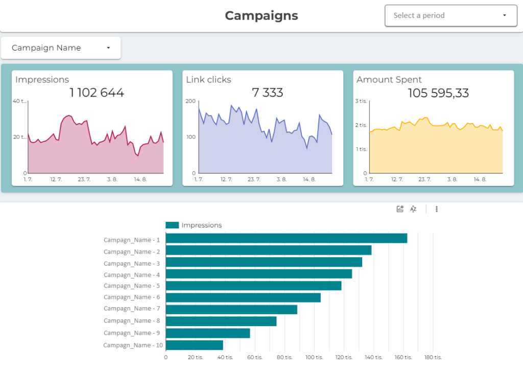
Overview objectives: to show customers the beauty of digital analytics and visualization in Google Data Studio, the overview of individual campaings and its relevant data.
Description: for this client we have prepared this free GDS template for their customers, with that they can see clearly the number of impressions, link clicks and amount spend for the specific period of time.
Audience Report
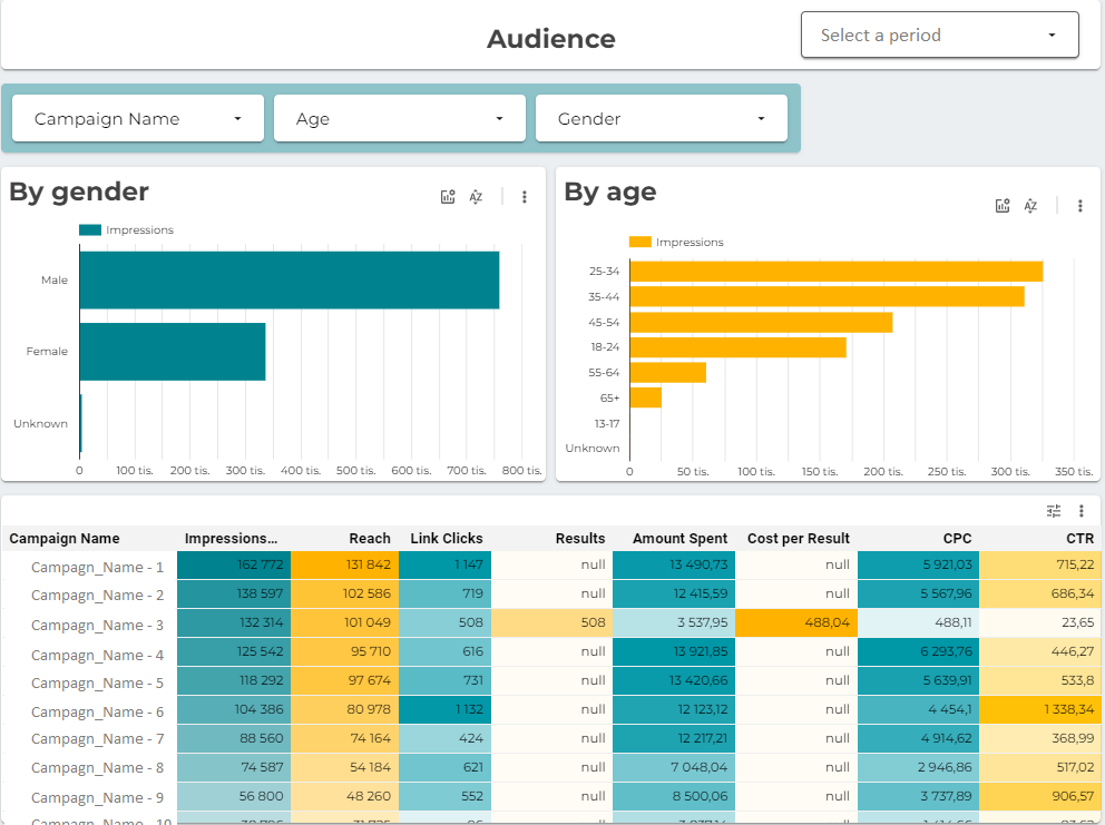
Objective: a quick overview of key metrics and details about the audience from campaigns
Description: an illustration how functionally and visually attractive at the same time an overview can look, an overview which every e-shop owner can open in the morning and see what happened and how are the numbers. The report is fully interactive, the client can customise all dimensions and metrix shown.
Above all, I would like to point out the possibility of filtering, where the user of the report virtually answers his questions, and the report is being recalculated for him.
At the same time, there is a number of calculated metrics used for part of a day, part of a week, and the user interests, that Google Analytics commonly does not report this way.
The icing on the cake is that if you have a GA account in your Google Account that has Advanced Ecommerce set up, you can enter your data at the top right and see the results. The report is ordinarily a part of the GA Demo Account.
Demo Dashboard
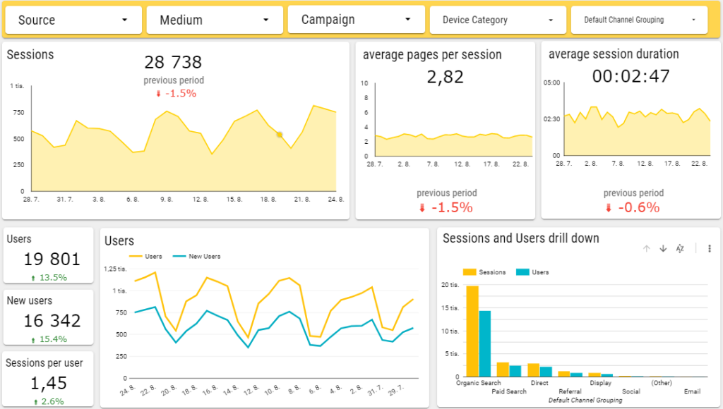
Objective: online activities overview for the Marketing Director
Description: an overview allowing prompt decisions, visually attractive at the same time, and the Marketing Director can use it for regular monthly or quarterly reporting. It shows work with other sources too (Google Ads, Facebook Ads), and also shows how we work with STDC in reporting.
- Besides visualization, we of course devote to the overall setup of web analytics.
Tools used
Google Analytics, Data Studio, PowerBI – what tools do we use?