
You spend hours preparing reports, carefully tweak the charts, send them to your colleagues and… silence follows? Maybe they open them once, but the next time a decision has to be made, they still go with their gut rather than your data. This scenario repeats itself in most companies. They often fall for the illusion that the more data a report contains, the better. The reality is different: in a flood of numbers, what matters is easily lost. Let’s change that. We’ll show you how to build a report that becomes a real engine of your business.
Summary for Those Who Don’t Have Time to Read the Whole Article
- Dashboards full of colour are often confusing. A useful report is simple, minimalist and immediately answers the question “what is going on”.
- A number on its own, without a comparison (with the plan, with last year), has no informative value.
- A CEO needs a traffic light (works/doesn’t work), a specialist needs detailed diagnostics. Don’t try to satisfy everyone with a single chart.
- For reports in Looker Studio or Power BI to work quickly and accurately, they need clean data from tools such as Keboola or BigQuery.
- Choose 3–5 main metrics (KPIs) that genuinely affect your profit, and track those.
Does it sound too complicated? We’ll be happy to help.
The Difference Between a Pretty and a Useful Dashboard
Many people who create reports fall into the trap of aesthetics. They try to impress with colours, shading and complex visualisations. The truth, however, is that simplicity beats complexity by a wide margin.
- A pretty dashboard – is full of pie charts, bright colours and animations. It may look modern, but the reader has to think for a long time about what the data is actually telling them. It often serves only for a “wow” effect at a meeting.
- A useful dashboard – is minimalist. It uses muted colours and a bold colour (e.g. red) only where there is a problem. It immediately answers whether we are meeting the plan. It relies on the principles of data perception, which say that the human eye compares lengths (bar charts) or positions (line charts) best, not angles or areas.
The 3 Most Common Mistakes That Bury Every Report
Why do most reports end up in the digital dustbin of history? The reason is not a lack of data, but its poor presentation.
- Cognitive overload (too much data) – if you cram 20 different charts onto one page, the reader doesn’t know where to look first. A good report has a hierarchy. The most important thing must be the biggest and at the top.
- Missing context – the number “1,000 orders” means nothing on its own. Is that a lot, or a little? Is it more than last year? Does it meet the plan? Without context (a benchmark, a target, a year-on-year comparison) the data is just empty noise.
- Unclear metric definitions – if marketing reports “conversions” from Google Ads and the sales department reports “orders” from the CRM, the numbers will never match. This leads to distrust in the data.
Report Layout: One Size Doesn’t Fit All
A universal report for the whole company is a myth. Different roles need different levels of detail.
Management (CEO, CFO, CMO)
Leadership doesn’t need to see every click. It needs a traffic light.
- Goal: A quick overview of the company’s health on one screen.
- Content: 3–5 main metrics (revenue, profit, costs).
- Visualisation: Big numbers with a trend indicator (green arrow up, red down).
- The question it answers: “Is something on fire, or are we on plan?”
Performance Team and Specialists
This is where we go deep. Specialists need a diagnostic tool.
- Goal: Uncover the causes of fluctuations and optimise campaigns.
- Content: A detailed breakdown by channel, campaign, device or region.
- Visualisation: Tables, heatmaps, detailed time series.
- The question it answers: “Why did the conversion rate of the Facebook campaign drop yesterday?”
Setting Priorities: How to Choose the Right KPIs
Less is more. Choose one main metric (the North Star Metric) that everything revolves around, and a few supporting indicators. The choice differs depending on the type of your business.
KPIs for E-shops (B2C)
Speed and transactions rule here.
- Main metrics – turnover (GMV), margin after returns and marketing costs, conversion rate (CR), average order value (AOV).
- What not to forget – measuring returns and Customer Lifetime Value (CLV). An order can look profitable until the customer returns the goods.
KPIs for B2B Companies
The process here is longer and more complex.
- Main metrics – the number of quality leads (MQL/SQL), the value of open business opportunities (pipeline value), sales cycle length.
- Emphasis on quality – it doesn’t matter how many people downloaded the e-book, but how many of them actually enquired about your services.
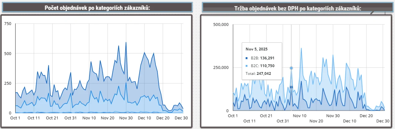
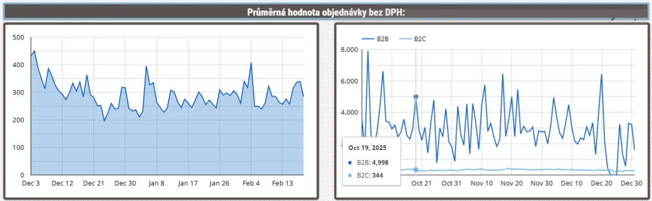
Illustrative image: a report showing order revenue by B2C/B2B segmentation
You might also be interested in: The importance of the data layer before launching campaigns for big events
The Technology Behind It: Where Does the Data Come From?
For a report to be trustworthy, it has to stand on solid foundations. A beautiful chart in Looker Studio or Power BI is just the tip of the iceberg.
- Data collection (Ingest) – we have to get data from the e-shop, advertising systems (Google Ads, Sklik, Meta) and the CRM into one place. Here we use tools such as Keboola, which act as the pipeline.
- Data warehouse – all the data is stored and unified in a data warehouse (e.g. BigQuery). This is where it is cleaned and connected. This is the domain of our Reporting and analyses service.
- Visualisation – only then do we send the clean data to tools such as Looker Studio (ideal for quick, shared reports) or Power BI (for robust corporate reporting).
This process ensures that reports don’t take five minutes to load and that the data in them is accurate and reliable. Without server-side measurement and quality data integration, you will be building a house on sand.
Conclusion
Creating a report that won’t end up forgotten is not about drawing pretty charts. It is about understanding the business and delivering the right information at the right time. A useful report must immediately show whether goals are being met, and if not, why not. Don’t be afraid to simplify the data, add context and always think about who will read the output.
If you are not sure whether your data is telling the truth, or you spend hours manually retyping numbers into Excel, it is time for a change. Automated and smart reporting can save you up to dozens of hours a month and, above all, save you money thanks to timely decisions.
Frequently Asked Questions
What is the difference between Looker Studio and Power BI?
Looker Studio (formerly Google Data Studio) is great for marketing reports, it is free and easy to share. Power BI is a more robust tool from Microsoft, suited to complex corporate analytics, connections to ERP systems and detailed data security.
How often should I update my reports?
It depends on the purpose. Operational reports for marketing can be updated daily (or even in real time), while strategic management reports only need updating weekly or monthly after the accounts are closed.
What should I do when the data in Google Analytics doesn’t match my CRM?
Small deviations (up to 5–10%) are common because of how measurement works (cookies, ad blockers). If the difference is larger, you need to audit your measurement and deploy more accurate technologies, such as server-side tracking.
How many KPIs should I have in a report?
There should be no more than 5–7 main metrics on one dashboard page. If there are more, human attention fragments and the ability to make quick decisions is lost.
Sources
Amplitude (n.d.). The North Star Framework. [online]. Available at: https://amplitude.com/blog/north-star-metric
Berinato, S. (2016). Visualizations That Really Work. Harvard Business Review. [online]. Available at: https://hbr.org/2016/06/visualizations-that-really-work
Bryar, C. and Carr, B. (2021). Working Backwards: Insights, Stories, and Secrets from Inside Amazon. New York: St. Martin’s Press.
Cleveland, W. S. and McGill, R. (1984). Graphical Perception: Theory, Experimentation, and Application to the Development of Graphical Methods. Journal of the American Statistical Association, 79(387), pp. 531–554.
Google Cloud (n.d.). Partitioned tables. [online]. BigQuery Documentation. Available at: https://cloud.google.com/bigquery/docs/partitioned-tables